.webp)
Sign Up / Sign In
.png)
Profile
Account
NBL26 Indigenous Round jerseys revealed
.avif)
Check out the stories and designs around each of the Indigenous Round jerseys for NBL26.
By
NBL.com.au
The Hungry Jack's NBL's Indigenous Round will be held across Round 6 and 7, during the 2025-26 season.
Every club's jersey has a unique story, with all the details explained below once revealed by each team.
CLICK HERE TO SHOP INDIGENOUS JERSEYS

Artist: Temaana Yundu Sanderson-Bromley.
Artist bio: Proud Adnyamathanha (Flinders Ranges), Narungga (Yorke Peninsula) and Wangkangurru-Yarluyandi (Simpson Desert) man.
Living in Adelaide on Kaurna Country, Temaana maintains a strong connection to his Yarta (land), especially the Flinders Ranges. As an artist Temaana reflects his culture and stories from Country learnt from family and elders and Temaana’ s art combines traditional and contemporary themes. Temaana has been practising a range of art forms for almost 8 years and started his own clothing and art business Mardlaapa Designs in 2021 that consists of apparel, workshops and commissioned art pieces.
Along with studying at the University of Adelaide completing a Bachelor of Marine and
Wildlife Conservation, Temaana works at the Aboriginal Basketball Academy (ABA) where he is a board member and mentor. As an alumni of the program graduating in 2022, Temaana as enjoyed coming back to the ABA to be able to support the students with their classwork, as well as pass on cultural and artistic knowledge to help strengthen their identities as young Aboriginal people. Temaana was supported by a group of Aboriginal Basketball Academy students in the design process of the jersey where they provided important concepts and direction with the project.

Jersey design story: This artwork tells the story of the Adelaide 36ers and Kaurna land – the Adelaide Plains and the waterways (river, ocean & waterholes) which stretch throughout it. The centre circle on which the players numbers is placed represents the 36ers on gameday with the players and staff all beside the Karrawirra Parri (River Torrens) as they all work together for the shared goal of club success.
Water sources were, and continue to be, essential to Aboriginal people, offering food, drinking water, medicine, and more. Beyond their physical importance, water plays a significant role in our creation stories, connecting people, places, and time. Scattered across the design are kangaroo tracks – a powerful symbol of continual forward movement. They represent the 36ers’ journey: facing challenges and hardships but always rising and pushing ahead.
People seated along the riverbanks represent the broader 36ers community, stretching from Adelaide across all South Australia – a reminder that the team is supported by a deep and diverse network of fans.
The four pink stars on the front of the jersey pay tribute to the club’s proud history, representing the club’s four championships and the four retired jersey numbers.
These stars are a reminder of the team’s legacy, the players who helped build it, and the moments that continue to inspire future generations. Acknowledging this history is central to the identity of the club and its connection to community, pride, and resilience.
The side panels of the design symbolise the ocean shorelines of Adelaide grounding then jersey further in local Country and place.
On the back of the jersey, a mountain range is featured along the lower edge and has two meanings. They represent both the Adelaide Hills on Kaurna Country, and a personal connection to the artist’s own Country – the mountains of Adnyamathanha yarta - Flinders Ranges.
The continual flow on of the rivers across the jersey represent the connection between the Adelaide 36ers and the Aboriginal Basketball Academy. The nine pink stars across the back signify the nine years of the Aboriginal Basketball Academy. This important initiative continues to provide life-changing educational and sporting opportunities for Aboriginal students across Adelaide and South Australia.

Artist: Cassie Dover.
Artist bio: Cassie Dover, founder of Deadly Creations by C.D., is a former professional basketball player who now coaches across South East Queensland, from grassroots to semi-professional (NBL1) level. Alongside her coaching career, Cassie is a passionate Indigenous artist, best known for her commissioned work including business artwork and custom uniform designs for sporting clubs. Recently, she has expanded her creative portfolio into clothing, footwear, homewares, and personalised art pieces. For Cassie, Indigenous art is more than a craft, it’s a source of spiritual connection, relaxation, and cultural expression that she embraces outside of her day-to-day work.
Nation: Cassie was born on Yugambeh country and is a proud Kunja women from Cunnamulla in Western QLD currently living on Quandamooka country.

Jersey design story: This year I wanted to embrace the Bullets and who they are. Brisbane represents the South East Queensland region, so in the background you’ll see the blue water and land representing the areas from the Sunshine Coast (Gabi Gabi) to the Gold Coast (Yugambeh), and out towards the waters of Moreton (Gower) and Stradbroke Islands (Quandamooka). It also encompasses the Wakka Wakka, Yagera and of course Turrbal lands.
The big centre circle represents the player (with their number inside), while the layers and people sitting around them symbolise those who support and guide them - family, mentors, coaches and community.
The footpaths extending out connect to five guiding principles that reflect how the club operates. The player’s footprints head toward these areas, while arrows point both ways to show how these beliefs also come back and influence the player.
All In – The spiral symbolises everyone coming together, with layers representing all parts of the club being united and committed.
- Agile – The flowing waves show the club’s ability to adjust and embrace change as it comes.
- Proactive – Arrows in every direction reflect being prepared and ready to take action, however needed.
- Grit & Resilience – The bell curve captures the ups and downs of the journey, with arrows pushing to the top, showing the determination to rise through challenges.
- Built for Brisbane – The circles of people and connecting lines highlight the way the club and the community are interwoven.
The side panels feature the colours of the Aboriginal and Torres Strait Islander flags, representing and honouring every First Nations person across the community and the league for this special NBL First Nations Round.

Artist: Uncle Henry Fourmile.
Artist bio: Hendrick Fourmile is Gimuy Wallabarra Yidinji Man. A traditional owner of Cairns (Gimuy). He is a descendant of his great grandfather's Jirtigiug and king Yeini of Cairns. His boundary lines are north of the Barron River south to Rice creek west to Emerald creek and the oceans of the Coral Sea. Whilst Henry owns his own business as painter and decorator he is actively involved in art and culture. Henry's art includes screen printing and ceramics. Well-known for his ceramic shield design necklace and coolamons. His art is a cultural practice be it in the form of storytelling for organisations special events and school to handmade gifts for visitors and foreign executives and ambassadors. Represents the Gimuy Walubara Yidinji nation.

Jersey design story: The uniform takes inspiration from Uncle Henry’s artwork representing the Seven Sisters Dreamtime story. It is widely known story by First Nations peoples across Australia and relates to the star cluster known as the Pleiades in the constellation Taurus. In Far North Queensland, this ancient story is also represented in the Atherton Tablelands with the Seven Sisters Trails, which link the towns of Atherton, Malanda and Yungaburra. The Seven Sisters guide, protect and watch over Cairns – comparatively, the Taipans represent the region with great respect, and go to battle for the city on the basketball court.

Artist: Glen Sutherland.
Artist bio: I am a WIRADJURI man from Orange in central west NSW, I have been painting for over 20 years, in this time I have been lucky enough to help design the first Indigenous jersey for the Illawarra Hawks and design the Illawarra sports academy Indigenous kit. My day-to-day job I work as the Aboriginal community liaison officer, I am highly involved with the community in the Illawarra and support many Aboriginal programs on a weekly basis.

Jersey design story:
Kangaroo on WIRADJURI Country
This painting is my interpretation of hunting for Bunder (kangaroo) on country.
The colours purple, pink (at dusk) & brown represent different parts of the landscape.
The blue represents the water after a rainfall.
The gathering places are men preparing their spears and hunting boomerangs for the hunt.
There are Bunder (kangaroo tracks) running through country, dodging boomerangs and also footprints, where the hunters have been.
Bunder (kangaroo) hunting is not just about hunting for food as most parts of the Bunder (kangaroo) are used; fur/skin for clothing & bones for spear points.
Hunting Bunder (kangaroo) is a practice that has been passed down through generations.

Artist: Ky-ya Nicholson-Ward
Artist bio: Ky-ya Nicholson Ward is a 22-year-old Wurundjeri, Dja Dja Wurrung, Ngurai illum Wurrung, German and Irish woman. She is based in Naarm (Melbourne). Ky-ya is a passionate First Nations artist who tells the stories of her ancestors, family and Country. She also uses her art to educate and to advocate political issues around the world. Ky-ya is also an activist, educator, mentor and dancer with Djirri Djirri Cultural Services.

Jersey design story:
Bunjil and Stars: Bunjil is Wurundjeri’s creator spirit, in the physical form of the Wedge Tailed Eagle. He gave life and breath to every living thing. Bunjil is a sign of guidance, connection to culture and honouring Wurundjeri people, Country and culture. Bunjil’s spirit lives in Tharangalk Biik (Tha-rraan-garlk beek) which translates in the Woiwurrung language to ‘forest country above the clouds’ which is Star Country. In the design there are many stars to honour Star Country. There is also the star Altair which is the eagle star apart of the Aquila constellation. Our creation narratives and stories are told through the stars. Bunjil watches us in his physical form in Wurru Wurru Biik (Woo-rroo Woo-rroo Beek) which is Sky Country.
Meeting Place: The meeting place symbolises gathering together for a purpose and celebrates the community, culture and environment at Narrm United. Honouring all the people involved with the club, including supporters, volunteers, staff, coaches, families and the players.
Possum Skin Panels: The panels are a symbol of honouring possum skin cloaks and our elders. Possum skin cloaks are a significant cultural aspect of Wurundjeri culture and a lot of Southeastern First Nations mobs, worn by elders. Its honouring the knowledge and wisdom our elders have and pass on from generation to generation. As a baby you are given a single skin with your totem burnt and etched into it. As you get older you receive more skins that are stitched together using marram (kangaroo) tail sinew and a bone needle. Women wear possum skin belts whilst dancing and conducting ceremony and eventually when you are an elder you have a cloak with your whole life story burnt and etched into it. Symbolising the journey of growth and every players individual life stories. It’s also a symbol of comfort, as it hugs you, just as culture and community wrap you in their arms. The designs within the panels have been used since time immemorial by my ancestors and depict Wurundjeri’s carving culture, as we carve into boomerangs, shields, cloaks, spears etc.
Blue Swirly Lines: The blue swirly lines represent the journey of truth telling and true reconciliation, where we can walk together side by side free from discrimination, racism and disadvantages, through respect and willingness to learn. We are the oldest continuous living culture in the world and that’s something we should all be proud of and acknowledge as a nation.
Diamond Linework (side panels): The diamond linework depicts the resilience and strength of First Nations peoples in Australia but also all over the world. It also relates to the resilience of the players and the club throughout each season.

Artist: Leroy Roberts
Artist bio:
I whakapapa to Ngāti Kahungunu & Falealili.
I was raised in South Auckland and I currently live in Papakura.
Māori & Pasifika art has always been a part of my life. Drawing, painting, carving, tattooing and now, digital.
My work stems from my cultural roots and is heavily inspired by ancient traditional practices dating back hundreds of years.
I am inspired by nature, history and people.
I take pride in serving our people and giving back to communities through charity work, course-based initiatives and creative outlets.
I dream and strive for an inclusive world full of art, kindness and gratitude. One that shares a vision of manaakitanga that is driven by a genuine love for one another.

Jersey design story: Inspired by the Manu (Bird) This design at the neck or top of the kakahu represents the vision both individually and as a team. The manu has the ability to fly solo but often travel in flocks and work together to provide. Koru facing each other represent all the people. Behind the scenes that keep the wheels turning, the acknowledgement of the collective efforts moving towards the same goal. The beak or ngutu represent communication, a vital part of a successful group. It's a reminder to be open and speak and ingest each other but also a reminder that a great leader must also be able to listen.
Niho/Taniko: This design reflects sheer grit and determination, the work nobody sees, the early mornings and late nights, the battle, the war. It reflects the bond through pressure and to rise to the occasion.
This section represents the heartbeat of the club, the motivation when the chips are low, the final push when the odds are stacked against us, the FANS. It recognises the support and uplifting walrus in times of need.
Whanau: These two mangopare swimming upstream pay tribute to our family. Above all, the people that sacrifice for us to do what we need to provide and also chase our dreams, we acknowledge them and their hard work as well as ours.

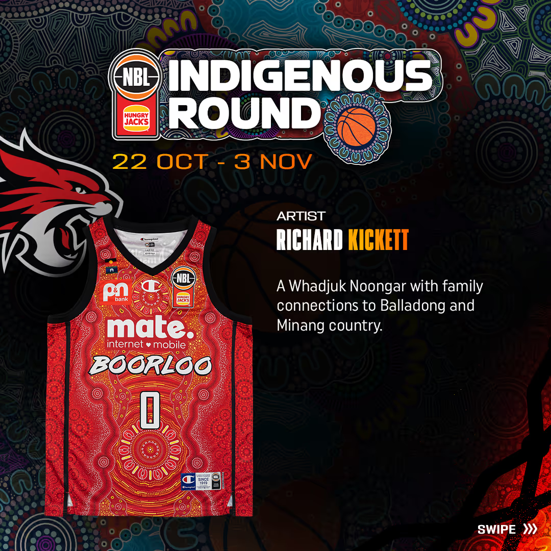
Artist: Richard Kickett.
Artist bio: I’m a Whadjuk Noongar with family connections to Balladong and Minang country. I’m 23 but turning 24 next months. I’ve been doing aboriginal art for 7 years, originally doing acrylic art on canvas being guided and inspired by close family but have now branched off and now doing my own Aboriginal art in different areas such as clothing, murals and digital.

Jersey design story: The design symbolises the evolving journey of the Wildcats over the years, reflecting the challenges they have overcome and the achievements they have celebrated. Throughout this history, one constant remains, the unwavering dedication of the people, including the players, staff and the fans who have always been the heart of this team.

Artist: Dixon Patten
Artist bio: Dixon Patten (Bitja) is a proud Gunnai, Yorta Yorta, Gunditjmara, Dhudhuroa man with bloodlines from Wemba Wemba, Barapa Barapa, Djab Wurrung, Wiradjuri, Yuin, Wodi Wodi, Wolgal, Monaro. As an artist, designer, mentor, influencer and a strong community advocate, Dixons artistic practice is informed through a strong cultural value that his family and community have imprinted into his mind, heart, and spirit.
His approach to his engagements is much bigger than an artistic visual; it is about the gifts and the influential shifts that creativity brings. Dixon’s narratives often delve deep into familial history, often in celebration and exploration of culture and connection and his willingness to share and learn are informed by the art of Deep Listening, or in his native Yorta Yorta language ‘Gulpa Ngawul’. This practice has guided many of Dixon’s expressions by uncovering the layers, exploring trauma, exploring grief, reclaiming culture, bridging gaps, being accountable, learning to understand and challenge systems, influencing spaces and learning to celebrate self. He takes his role as a storyteller seriously and feels humbled to continue this strong aspect of Aboriginal culture.

Jersey design story: Songlines are pathways of knowledge that traverse across the Australian continent and spans from past to present to future, symbolising Aboriginal and Torres Strait Islander People’s cultures and successful longevity through many millennia. Our cultures are diverse; there are around 500 Nations, each layered with unique customs, lore, languages, totems, spiritualities and kinship structures.
Our songlines inform our diverse history, lore, dreaming stories, memory, relationships, ceremony, language, spirituality, trade economy and how we connect to and remember Country. Deep listening was fundamental to receiving and sharing knowledge; helping to understand where to go and where not to, when to harvest and cultivate and understanding seasonal shifts to allow Country to replenish.
Sharing helped keep us safe, our ability to successfully retain information was through our dreaming stories and storytelling practices; they were more than fables, they are maps to guide our values and guide our journeys (physically and spiritually).
Our relationships to each other are important for our survival, our songlines are also trade routes that formed one of the world’s oldest economies. Songlines inform our conscience and values; a reminder that we are part of something bigger than ourselves; and by being accountable to ourselves, we are accountable to others.
This art honours all the richness in our history and cultures, our success in connecting to and living in harmony in such diverse and often harsh landscapes, for such a long time, is truly a marvel.

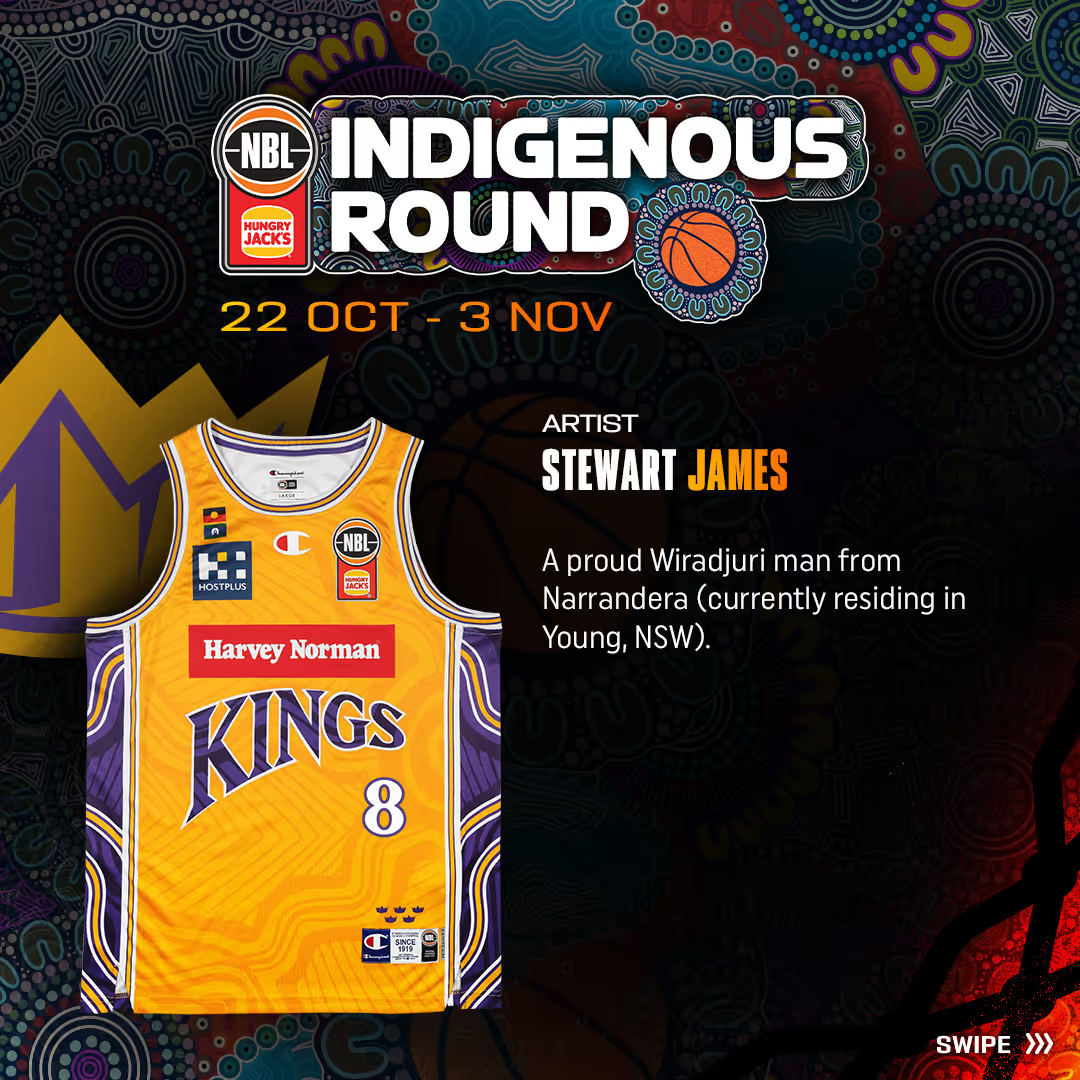
Artist: Stewart James.
Artist bio: Stewart James is a proud Wiradjuri man from Narrandera (currently residing in Young, NSW). He has more than 20 years of experience as an artist and more than 15 years working in education. The NBL26 season will be his fifth working with the Hoops Capital club.

Jersey story design:
We Are the Kings – A Story of Identity
This design is a powerful reflection of identity — a reminder that to move forward, we must first know who we are and where we come from.
Rooted in the stories that have shaped the Sydney Kings, the artwork honours the club’s proud legacy, representing not only the team but also the people, places, and communities across Sydney. Every element has been carefully crafted to reflect the deep and diverse connections that form the heart of who the Kings are.
At the centre of the design are five meeting place symbols, acknowledging the ancestral lands and waters of the many First Nations Clan Groups that span Sydney’s footprint. These symbols speak to ancient connections — the foundations of identity and belonging. Radiating from them are swirling lines, illustrating the ongoing link between old and new stories, past and present generations. These lines represent a living journey, one that continues to be written each time the Kings step onto the court.
The same five symbols also represent the five championship titles — a tribute to the club’s success and its legacy, grounding the team’s identity not only in community, but also in excellence and achievement.
Diamond-shaped patterns woven throughout the design symbolise strength and protection. Inspired by traditional shield markings, they remind us of resilience — of cultural pride carried through time, from Country to court.
Finally, the circular patterns reflect Sydney’s rich cultural diversity and shared knowledge. They represent the unity of people from all walks of life who proudly stand behind the Kings. Through this design, identity is not just told — it’s worn, honoured, and celebrated.
Because the Kings don’t just play for Sydney.
They are Sydney.

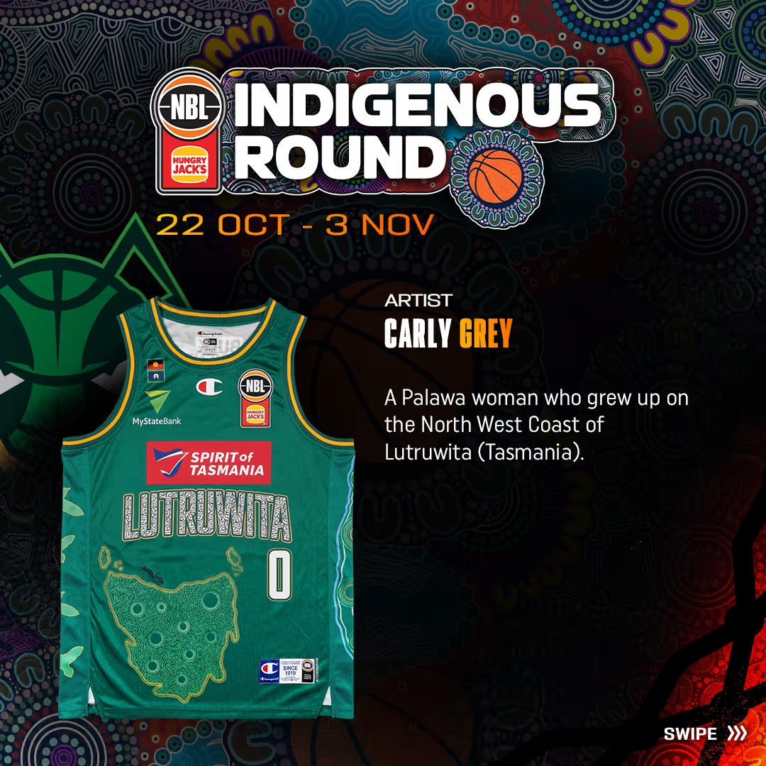
Artist: Carly Grey.
Artist bio: I am a palawa woman who grew up on the North West Coast of Lutruwita (Tasmania). I have lived on Noongar country (Western Australia) since 2019. I completed a Bachelor of Arts majoring in Sociology and minoring in Aboriginal Studies. In December 2024 I completed my Masters in Primary Education. I am currently working in a First Nation Liaison role in a primary school as well as doing relief teaching on my off days. In my spare time I coach at a gym and work on projects for Krakani Creations, my art business. I started my art journey in 2021 as an emotional outlet to connect to my heritage and build on my cultural identity. Using art, I have found stronger connections in my personal relationships through healing and educational conversations. I hope to continue my artistic journey in the future as well as incorporating my knowledge into my teaching while I continue to learn and create.

Jersey design story: This design centres around the traditional name of Tasmania, Lutruwita. This includes maireener shells. Maireener shells hold cultural significance for palawa women, in the creation of shell necklaces, an art form that has been passed through generations representing connection to country and ancestry.
Mutton birding still remains a significant cultural practice within the Tasmania Aboriginal Community. This practice reinforces cultural knowledge and maintains cultural tradition. There are 9 yullas (mutton birds) on the left displayed to represent the 9 traditional countries in Lutruwita. On the right side, there are waterways separated by 9 meeting places, again for the traditional countries. Waterways are central to the palawa/pakana people for sources of food, transport routes, and spiritual places tied to ancestral stories.
The 9 meeting places representing the traditional countries can also be seen on the map of Lutruwita in the centre of the jumper. The map is filled with journey lines representing connection to country through stories, knowledge, and experiences. A jack jumper can also be seen sitting on the coastline of Lutruwita.
The 9 circles on the shorts represent petroglyphs, traditional rock carvings that serve as an enduring record of our culture reinforcing the deep and continuous connection to culture. A Jack Jumper is also presented on the coast of Lutruwita on the front of the shirt.
The back of the shirt shows 5 yarning circles each with 5 people symbols that represent all involved with the Jack Jumpers - players, staff, community, members. The number 5 is used to once again represent the 5 years the JackJumpers have been in the competition. Within the yarning circles, 5 thylacine paw prints can also be seen.

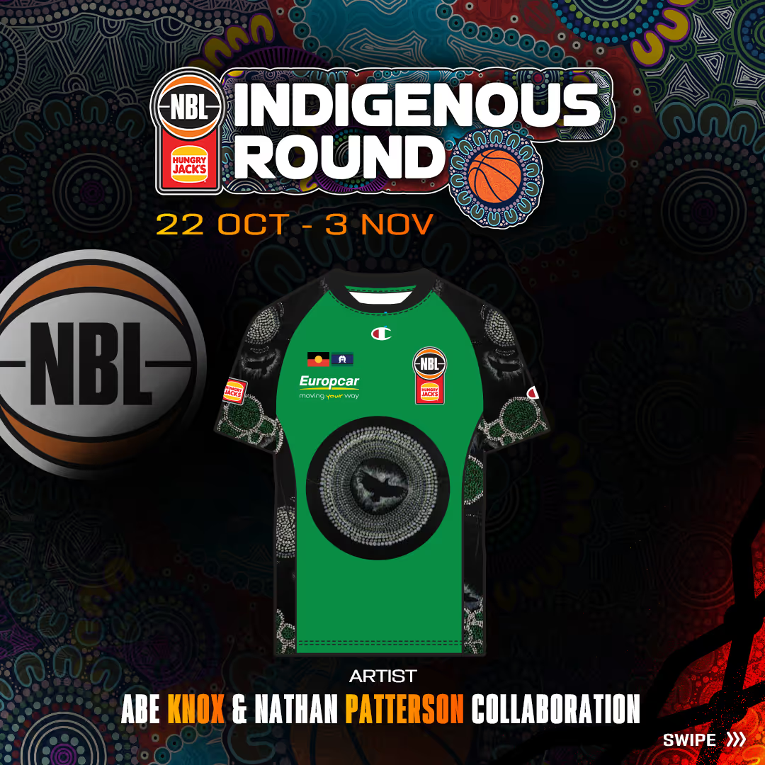
Artist: Nathan Patterson
Referees jersey design story: “Yeeram Nyoo – just one more day”.

A line of merchandise collaboratively designed by the family of Abraham Knox, a much-loved young man, lost too soon, and Nathan Patterson, both proud First Nations people. The design draws inspiration from an artwork crafted by Abe himself, symbolising connection and coming together. The feather motif evokes the spirit bird, carrying the spirits of our loved ones on their journey to rest with our ancestors.
These products aim to initiate conversations about mental health. The name, derived from the Waddawurrung language, translates to “one more day,” symbolising hope and resilience in the face of mental health struggles. When people feel so overwhelmed and hopeless, a reminder that holding on for one day can make such a difference.


